GeekWire
mobile newsfeed application

CONTEXT
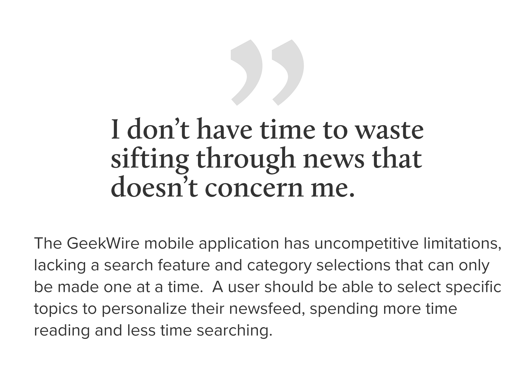
GeekWire is a trusted resource for tech related news focused on the Pacific Northwest, with its proprietary staff of journalists. The GeekWire website has many features such as browsing tabs to filter the content and a search feature that users appreciate. The mobile application is quite limited lacking a search feature and category selections can only be made one at a time. The redesigned mobile app should offer news a browsing experience equivalent to the GeekWire website.
ROLE: Interaction Designer, Project Manager
During this case study, I was the interaction designer developing prototypes and collaborating with the Visual Designer Clare Lee. I was also the Project Manager, the point of contact for the client leading presentations, and responsible for the schedule of activities
DURATION: Two Weeks
TEAMMATES: Clare Lee - User Research/Visual Design, Abdurahman Ashoor - Information Architecture, Content Strategy
DELIVERABLES: User Flows, Paper Prototypes, Lo-Fi Interactive Prototypes, High Fidelity Interactive Prototypes
INSIGHTS

SOLUTION

This version was an attempt to make the user choose whether to create an account when installing the app for the first time, hoping this would improve engagement. After further review of Apple iOS guidelines, it indicated this was not recommended. This is a news browser and shouldn’t require a disruptive personalization reminder when first installed. A majority of users preferred single line listed categories rather than two categories listed side by side. The news feed was split between an 'All News' with unfiltered content, and the added "Your News' tab which would display news based on the user's selected categories in their profile.
RESULTS
User testing demonstrated a majority of users preferred the listed news articles with a left justified image. Users described the frustration of scanning a list with right justified images, “I read the first line of the headline, and then I’m distracted by the image at the end making me re-engage the headline again...”
After feedback from the previous prototype, this version had a revised tab bar with four key features and the search feature in a familiar location. The tab bar would enable a user to toggle between news and ‘my news’ indicating the mode with color in the high fidelity comps to come. User feedback from this iteration indicated users appreciated the personalized newsfeed categories and didn't feel that app had become more complex.
"This app is so straightforward, it's almost intuitive."
"It lets me concentrate on the news content, without distractions."
PROCESS
User Flow
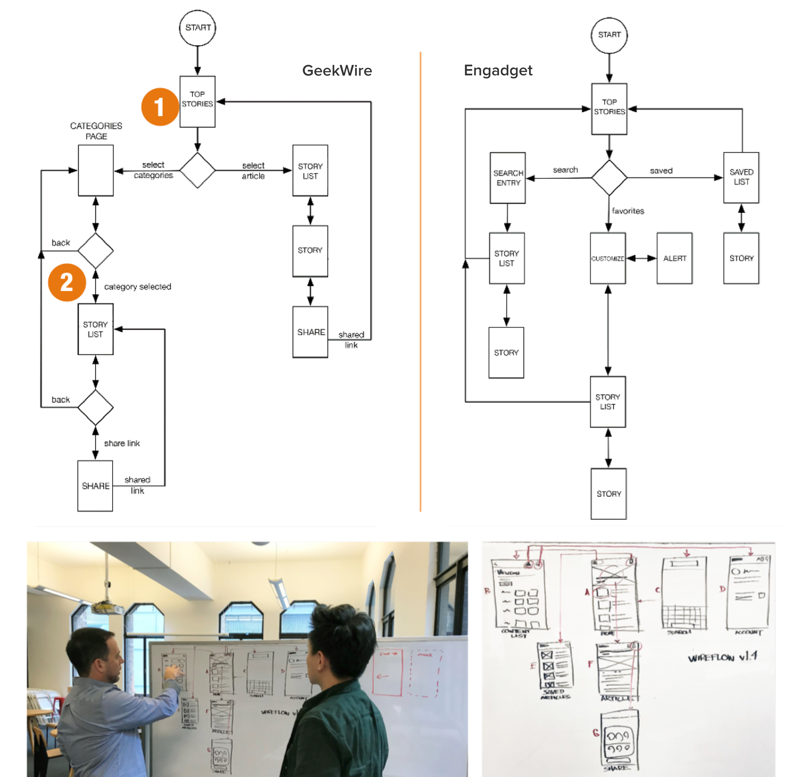
We began a user flow analysis by comparing the current GeekWire mobile iOs app to a competitor. I created the user flow maps of the current GeekWire app and compared it with Engadget as a reference in our discussion of the redesign. Our team had design studio sessions to discuss the content screens and what navigation features should be included.
Frustration Points: 1. Lack of a Search Feature, 2. Only a Single Selection Category at a Time
Layout Comparison Feedback

We learned that there were two significant news app layout archetypes that were similar to the GeekWire app. The New York Times, USA Today and Medium use a multi-article list below a headline. Engadget and Tech-Crunch apps use a full bleed single headline with a left-right swipe browsing. After the previous user feedback session, almost all news app users preferred the multi-article format. The feedback I received validated our choice to pursue a multi-article list layout.
Iterative Prototypes 3.1 - 3.5

After feedback from the previous prototype, Version 3.1 has a lower tab bar with three features. The search feature at bottom right isn’t intuitive according to users. In this version I attempted to make the user choose whether to create an account when installing the app for the first time, hoping this would improve engagement. After further review of Apple iOS guidelines, it indicated this was not recommended, this is a news browser above all and shouldn’t require a disruptive personalization reminder when first installed.
The priority of ‘content first’ for our target persona justified removing the lower tab bar from the article page. Version 3.5 had a revised tab bar with four key features and the search feature in a familiar location. The lower navigation would enable a user to toggle between news and ‘my news’ indicating the mode with color in the high fidelity comps to follow.
Prototype 3.8 Comparison + Visual Design (CL Jin)

Next Steps
Reorganize GeekWire Categories
This project began from the perspective of trying to make the most improvement in selecting categories without renaming them or creating subcategories. Further improvements might be made by revising, renaming and eliminating some GeekWire categories.
Stakeholder Interviews
We weren’t able to contact stakeholders at GeekWire during the short duration of this project.
Continued Testing and Visual Iterations
It is recommended that the app interface should be tested with a more diverse set of users. A formal style guide would be beneficial to guide development.